The Psychology of Color: How Palette Choices Affect User Experience
The psychology of color plays a crucial role in shaping user experience, influencing emotions, perceptions, and behavior. Different colors evoke specific feelings; for instance, blue often instills a sense of trust and calmness, making it a popular choice for financial institutions. In contrast, vibrant colors like red and orange can create urgency and excitement, prompting users to take immediate action. Understanding these associations helps designers make informed decisions when creating color palettes that align with their brand identity and objectives.
Moreover, the impact of color extends beyond mere aesthetics; it can enhance usability and accessibility. When combined thoughtfully, colors can guide users' attention and improve navigation. For example, using contrasting colors for call-to-action buttons can significantly increase their visibility, leading to higher engagement rates. Additionally, incorporating color theory principles, such as complementarity and harmony, can create visually appealing designs that enhance user satisfaction. Ultimately, a well-considered color palette not only enriches the visual experience but also fosters a deeper connection with users.
Choosing the Perfect Color Scheme for Your Brand Identity
Choosing the perfect color scheme for your brand identity is crucial, as it serves as the visual foundation that communicates your brand's personality and values. Colors evoke emotions, and their psychological impact can significantly influence consumer behavior. For instance, blue often conveys trust and reliability, making it a popular choice for financial institutions, while red can evoke excitement and urgency, frequently seen in sales promotions. Therefore, it’s essential to consider your target audience and the message you wish to convey when selecting your brand’s color palette.
To effectively choose a color scheme, start by creating a mood board that reflects the feelings you want your brand to evoke. Utilize tools like Adobe Color or Canva’s color palette generator to experiment with different combinations. You may want to consider using a triadic scheme, which incorporates three colors spaced evenly on the color wheel, or an analogous scheme that uses colors next to each other to create a harmonious look. As you finalize your colors, remember to evaluate how they work together across various mediums, such as digital platforms and print materials, to ensure consistency in your brand identity.
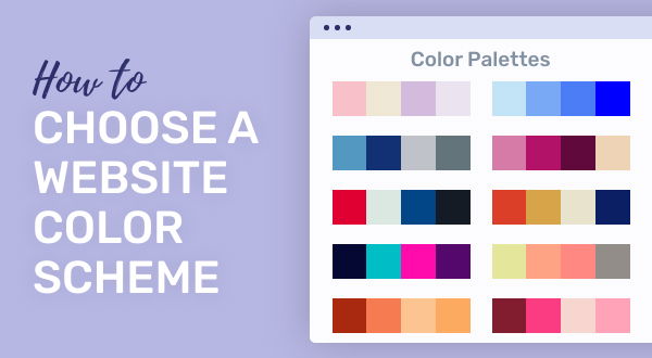
Top 5 Color Palette Trends for Modern Websites
As we enter a new era of web design, color palettes are becoming increasingly important in creating visually appealing modern websites. One significant trend this year is the move towards pastel tones. Soft pinks, blues, and greens are dominating the scene, providing a soothing and inviting look. These colors not only evoke a sense of calm but also allow for flexibility in pairing with different design elements, making them ideal for brands aiming for a minimalist aesthetic.
Another exciting trend is the resurgence of vibrant gradients. Websites are now incorporating bold gradient backgrounds featuring bright hues like electric blue and deep magenta. This trend adds depth and dimension, helping elements stand out and catching the user's eye. As we explore these trends, consider how the right color palette can enhance user experience and engagement on your site.